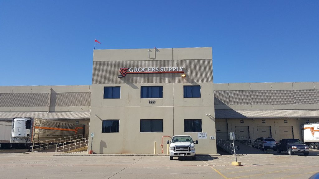
Coppell is home to a number of distribution facilities. Well-known names include Lucent and now Grocers Supply. When the company moved to the city, it took over an existing structure. To ensure proper branding and wayfinding, the business’ management team contacted our experts to discuss the installation of a building sign.
We visited the location and noted that there was still some signage left over from the prior tenant. Once we worked on the design of the new channel letters that the client planned to display, we ensured that they would meet the requirements of the city’s stringent sign ordinances. After discussing the options, the Grocers Supply management team decided to brand its facility with non-illuminated reverse channel letters. In Coppell, TX, this type of sign is a welcome addition to building facades.
We started the project by fabricating the channel letters. They display the company’s name in white while the logo portion features black and orange tones. Next, we prepared the building’s front by removing the leftover signage from the previous tenant. There were also some banners that needed to be taken down. With the building’s facade cleared, our installers mounted the channel letters centered just above the two light sources that are part of the wall. Now, the product accurately advertises the company’s presence and communicates its brand message.
Grocers Supply is one of a growing number of businesses that choose to feature their brand persona with channel letters. Our clients usually pick illuminated and non-illuminated products. Both types of signs feature sturdy aluminum that we shape into the letter font. For non-illuminated reverse channel letters, the entirety of the product is made of the metal. Impervious to insect attacks, rust, and similar damage, clients will enjoy many years of use from this construction.
For the client who prefers to display illuminated signage, the construction is a little different. Although we still shape the letters in the same way, we now include LEDs inside the hollow cavities. But there are other differences, too.
- Acrylic fronts. When you like the light to shine through the letters’ fronts, we close those up with translucent acrylic, rather than aluminum, which we painted in your chosen tone. During the day, your corporate color displays as you would expect. After dark, it illuminates from within and shines brightly, thereby heightening your brand message’s appeal.
- Clear polycarbonate backs and aluminum fronts. To achieve a halo effect, we close the fronts of the letters with aluminum, in the traditional reverse channel letter design. Painted to feature your corporate color palette, the sign impresses by day. After dark, light escapes through the clear polycarbonate backs. This setup bathes the sign in a halo of light, which looks stylish and adds pizzazz to your facade.
- Clear acrylic fronts. The open-face design is a specialty that appeals to a smaller clientele. It requires neon lights and imitates the old style building signs that you may remember from film noir features. The retro look is chic and currently quite hot. Although the letters look as though we had left the fronts open, we do close them with a translucent acrylic sheet to protect the neon bulbs.
If we have piqued your interest in learning more about channel letters in Coppell TX, contact our sign pros today!

