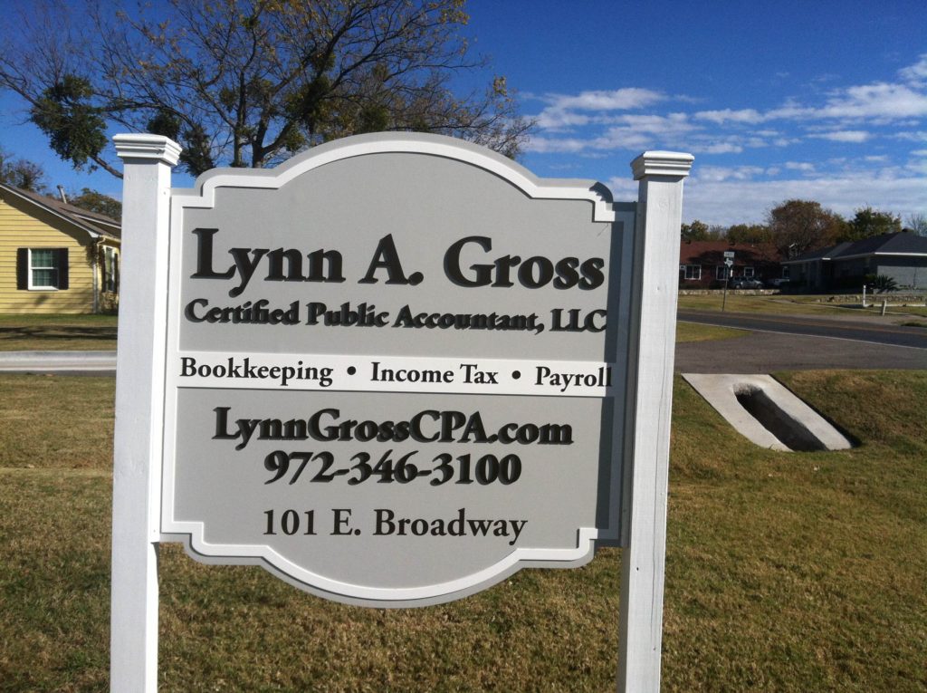
Located at 101 East Broadway Street, Lynn A. Gross, CPA, does business in the historic area of Prosper, TX. The company is a Next Generation Accounting Firm, which offers clients the advantage of specialized year-round attention to (and care of) their financial health. When the business needed a sign, the owner ran into problems and received a referral to our experts since we specialize in signage design.
Historic Parts of Town Have Special Sign Rules
 The advantage to doing business in the historic part of town is the beauty of the surrounding area and the foot traffic you reel in because folks like to visit there. On the downside, you have some added limitations when it comes to selecting your outdoor signs and advertisements. Case in point is this professional’s business sign.
We met with her and customized a design that would fit right in with the area’s overall ambiance. Because the sign required a variance, we worked with our client to hit all the right notes in the sign’s design that would ensure a speedy approval. By highlighting the marker’s consistency with the overall historic look and feel of the area, city officials granted our request. Our experts then manufactured the product that underscores the home-turned-business setting.
The post and panel design features custom cut wood that we shaped with decorative touches. Gray and off-white tones create a visual appeal. Because wood is the preferred material, we used pressure-treated posts that add longevity to the overall setup. We painted them in white, which accentuates the ornamental bordering of the panel. Black dimensional letters spell out the company’s name and impress with a slight shadow play when the sun shines brightly on the marker. The finished product is elegant, looks perfectly in place, but stands our sufficiently to attract the attention of prospective clients.
Customizing a Signage Approach with the Area’s Atmosphere in Mind
The Office of Lynn A. Gross, CPA, is not alone when running into specialty signage requirements. Cities and neighborhood associations levy specific rules on companies that set up shop in areas where an atmosphere contributes to the locale’s draw. For example, a small town atmosphere is a highly desirable backdrop for commercial enterprises, but these folks have to adjust their signage in keeping with the vibe. This frequently means that channel letters, lightbox cabinets, and lit monument signs are not possible to use.
Other cities and shopping neighborhoods have instituted rules that specify displays of only blade signs or limit material usage to high-density urethane (HDU) and wood. Because it takes a full-service sign shop to work within these narrowly defined parameters, we frequently meet clients who have gotten frustrated in the process. Some tried to go it alone by using online print shops. Unfortunately, the city ordered sign removals or was unwilling to issue a variance.
Avoid the frustration and aggravation by enlisting our signage design experts. No matter how specialized the covenants of your neighborhood or city might be, our graphic artists and technicians can create signs that bespeak your brand and look great.
Call us today to learn more!

