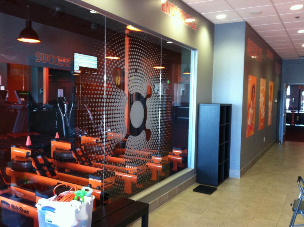
Once again, our sign pros had the opportunity to work with the friendly folks at Orangetheory Fitness. For the Southlake, TX, location, we produced channel letters and ADA signs. When doing work for the Plano facility, we put together inspirational wall lettering. Now, this venue’s team called us back to design, manufacture, and install a window graphic of the company logo in Plano TX. This graphic does not go on an outside-facing glass panel but instead installs on a glass window divider that separates the main hallway from the workout machine room.
The trick here was to provide an appearance that contributed to the ambiance and fit right in rather than stand out. Our technicians prepared the graphic using white vinyl that highlights the great look of the corporate logo. It partially obscures the view inside the room, which creates the separation. That said, the style elements’ overall density is not so pronounced that it cuts off the room from the rest of the setting, which would visually reduce the spaciousness of the locale. In a very real way, this window graphic has a Goldilocks effect.
What is the Goldilocks Effect?
 We might use the term tongue in cheek, but it really denotes a sign product that fits in just right with its environment. It harmonizes perfectly with other signs around it. What is most important for this type of sign is the fact that it fulfills a function. In this case, it brands the business, but it also adds interest to a window that would otherwise look as though something was missing.
How Do You Know a Signage Component Fits in Just Right?
Our pros gladly visit your location for a site survey. During this visit, we take measurements and catalog nearby signs. When we combine the survey with a consultation, we will ask you about your reasons for putting up the sign product. Some business owners need another way to brand while others want to reinforce name recognition or product awareness. The aim of the signage installation directly affects the manufacturing method, which in turn results in the creation of a perfect fit.
Why Choose Vinyl Window Graphics for the Interior Glass Panels?
This practice is far more widespread than you might imagine. Because open-concept office spaces have done away with plenty of walls, glass panels now take their places. However, in so doing, the absence of privacy and the need for spatial definition have given rise to a need for budget-friendly products that get this job done. Because these graphics come in a broad range of appearances, colors, and design styles, they quickly rose to the top as the superior signage option.
How to Order a Window Graphic of the Company Logo in Plano TX
If we have inspired you to take a page from the playbook of Orangetheory Fitness and display your logo as a brand message via interior window graphics, discuss your plans with our visual artists. We help you turn your vision into a reality!
Call us today to schedule a design consultation and site survey!

